zoey xie design

Redesign Sake App
SakeWiz
SakeWiz is an online sake community and an on-stop sake app. SakeWiz strives to connect the world with sake by providing an integral sake experience that includes label-scanning, managing collection, rating&reviewing, etc.
Project Type /
UX/UI Design
Year /
2018
My Responsibilities
Information architecture
Wireframing
Prototyping
Platforms
iOS, Android
Background
About SakeWiz
SakeWiz is a startup formed by a group of sake enthusiasts who aim to "connecting the world with sake ". With countless apps dedicated to beer or wine, SakeWiz realized that sake as an amazing Japanese traditional beverage is lacking representation in the global community. After its first few releases, I got the opportunity to redesign the SakeWiz App for a better user experience.
Understanding Goals
The first step was to interview stakeholders to better understand the company's goals. From the conversations, I learned that SakeWiz is trying to establishing the most powerful sake database and sake-label recognizing technology, having these two strong points in mind, we developed 4 goals we wanted to achieve with the redesign.

Understanding Target Audience
Although the original idea of SakeWiz came from sake enthusiasts, we didn't want our user range stops from here, to broaden our target audience, I created personas to highlight the characteristics and used them as a guideline for the redesign.

Challenge #1
Incoherent information architecture
The incoherent information architecture of SakeWiz was the first problem I began with. First, unorganized functions and contents make the new user very difficult to navigate, resulting in a long learning curve that may frustrate the user. Second, incoherent information architecture doesn't help with service growth. I realized the engineers kept squeezing the new functions into the main page(home page) hamburger menu while even more functions being developed, ending with a messy home page and a long hamburger menu.

Affinity Mapping
By listing out all the functions and contents the previous version had, I held an affinity mapping session with the stakeholders. We organized all the post-its in clusters according to the goals and ideated some new functions. Eventually, we settled with a more organized and expandable structure.

Old ver.

New ver.
Wireframe
I started to build low-fidelity wireframes according to the redesigned structure and discussed with stakeholders for further feedback.

Results
The new information architecture has a clearer logic and eliminated the unnecessary/repeated entrance. With the new tab bar menu design, users could navigate easily and find everything without big effort.

Challenge #2
Insufficient Browsing & Searching Experience
The SakeWiz was designed for sake enthusiasts in the first place, they may not have trouble finding the specific sake when they have enough knowledge. However, to broaden our target audience, we have to understand that the novice and casual drinker users can be frustrated and confused and we expected them to have different behaviors and needs. I mapped user interactions with all personas in mind and made a flow chart of browse&search experience to find out the pain points.
Old Design Browse and Search Flow

Redesign
I found 5 pain points that added friction to the searching & browsing experience and here's the comparison of before and after:
Pain Point #1- Limited Browsing Experience

Old ver.

Low-fidelity Redesign Prototype
After
-
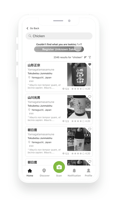
Added browse function for the novice and casual drinker users so that they can search for the right sake even when they don't know the specific name
-
Added popular sake and reviews to the home page, made it easier for users to catch with the trend
-
Moved the sake catalog summary to search. The majority of the users never realized it's a clickable function
Before
-
Limited browse function can only browse from entire sake catalog or recommendation
-
It's very difficult for the user to realize the number of sake is clickable and will bring him/her to a search page
Pain Point 2&3: Frustrating Filter Experience
Before
-
Endless filter options and expert-level glossary🥵
After
-
Added explanation card in the search page for sake glossary, it can help the user to gain sake knowledge while exploring
-
Made all options visible from the first view so that it's easier to select
Low-fidelity Redesign Prototype

Old ver.
Pain Point 4: Failed scan dead-end Experience
Before
-
Nothing is provided to help users to move on with searching
After
-
Three options are provided to users according to different use cases: photo guidance, Register a new label, try text search, supporting users to have a smoother experience.

Low-fidelity Redesign Wireframe

Old ver.
Redesigned Browse and Search Flow

Visual Design